Morley Case Study
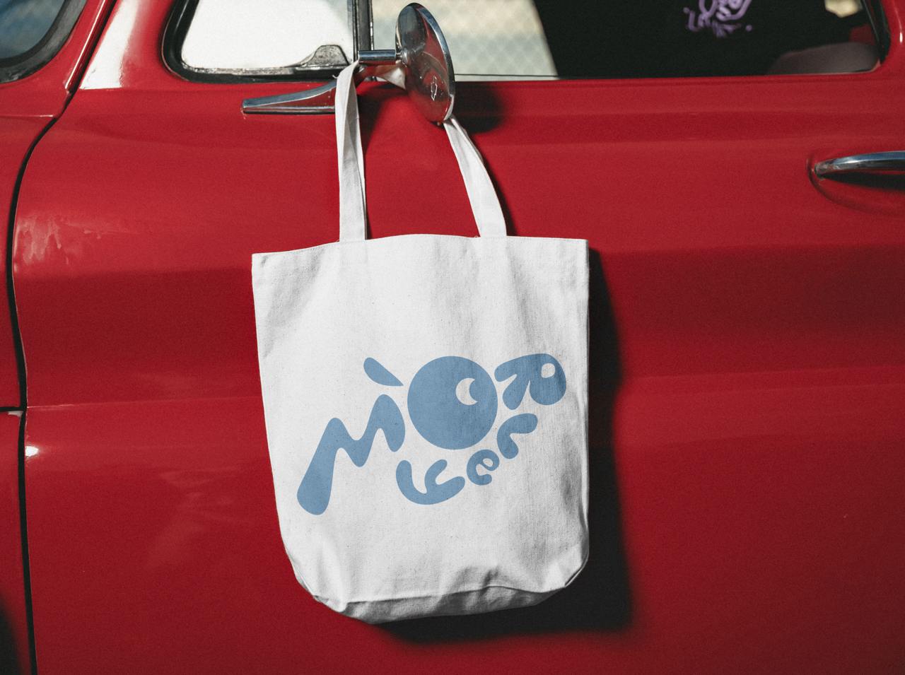
A fresh visual identity for Morley, a Belgian kids' clothing brand, aimed at aligning their logo and overall branding with their playful, youthful audience.
Brand Audit & Initial Design Process

Research & Competitive Analysis
An analysis of Ghanda, an Australian clothing brand, helped shape our approach. Ghanda’s cohesive branding is consistent across their children's and adult lines. For Morley, this research guided us to maintain consistency in typography and visual elements, ensuring the brand resonates with its target market.


Logo & Visual Direction
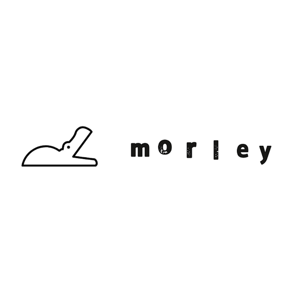
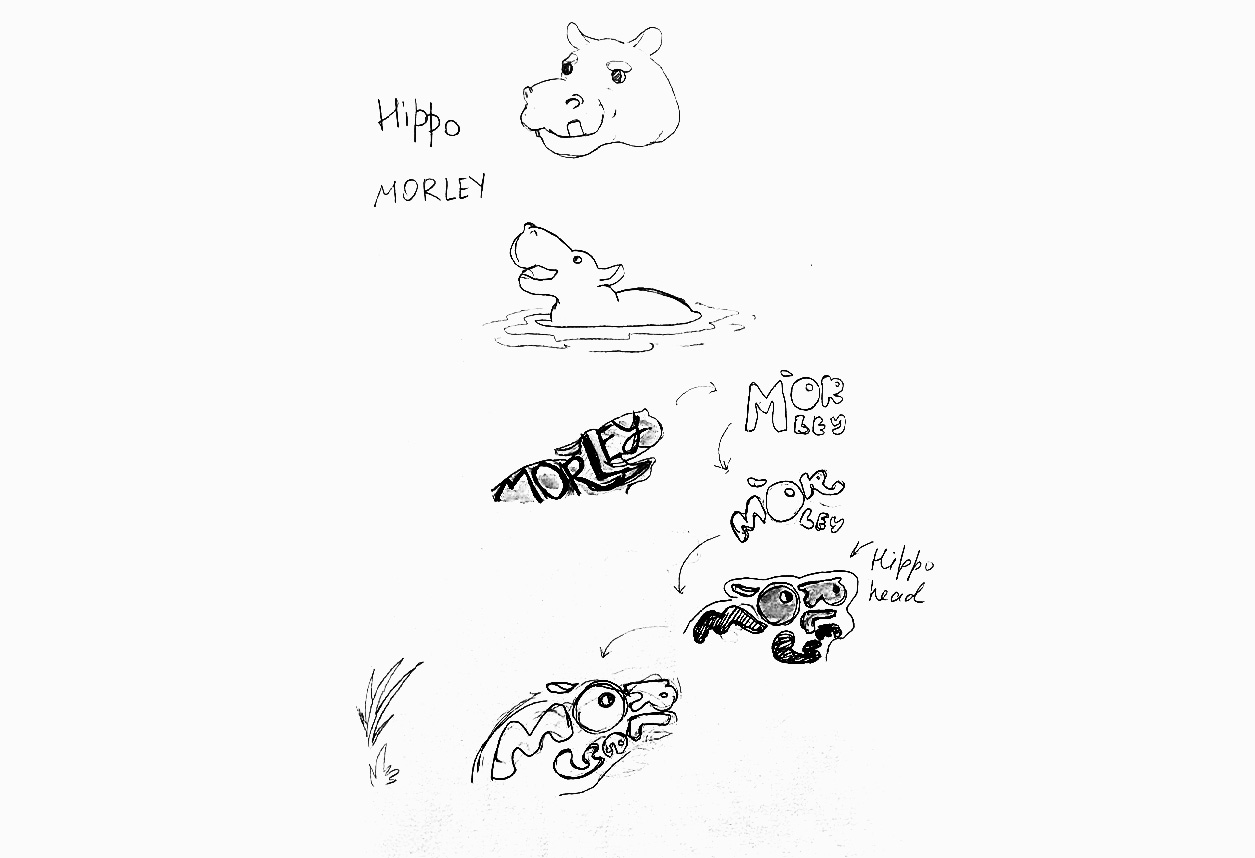
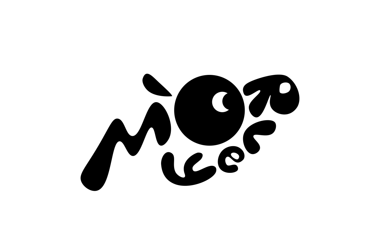
Morley’s existing logo features a juxtaposition of a vector hippo and grunge-style text. However, the combination lacks harmony. The goal was to refine the logo into something playful, yet modern, without the visual clash seen in the original.
Challenges & Solutions
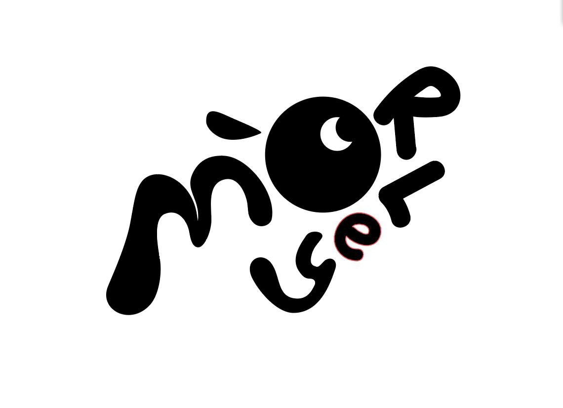
One of the major challenges was maintaining a balance between playfulness and professionalism without alienating Morley's audience. This was resolved by simplifying the logo, aligning it with the brand’s playful yet modern visual language.

Tools & Techniques
The tools used in this project included Adobe Illustrator for logo creation and Adobe Photoshop for mockups and UI design.
Final Design Outcome
The redesigned logo for Morley perfectly captures the brand’s essence, balancing playfulness with simplicity, and aligning with the company’s core values of youthfulness and a fun-loving spirit.

