GreenPan Logo Rebranding
This case study focuses on the logo rebranding of GreenPan, a leading eco-friendly cookware brand, and compares it with HexClad, a competitor known for its strong brand identity.
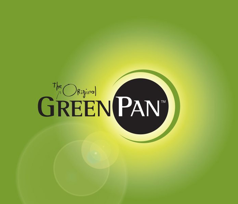
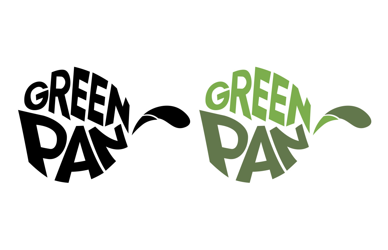
GreenPan Logo Analysis

HexClad Logo: A Good Example
HexClad’s logo stands out due to its sleek, modern design and strong alignment with its brand ethos. The hexagonal symbol reflects the cookware's unique design while the bold typography reinforces its premium positioning. The black-and-white color palette exudes sophistication and versatility, making the logo memorable across various mediums.

Comparing GreenPan and HexClad Logos
While GreenPan's current logo reflects eco-friendliness, it lacks the premium feel of HexClad’s logo, which effectively combines strong typography, modern design, and direct product symbolism. This comparison highlights the need for GreenPan to adopt a more contemporary design approach to remain competitive.
Opportunities for Improvement
GreenPan's logo can benefit from a more minimalist, flat design that better represents the brand's modern, eco-friendly values. Additionally, clearer cookware-related imagery and a refreshed, sans-serif font can elevate its visual identity.
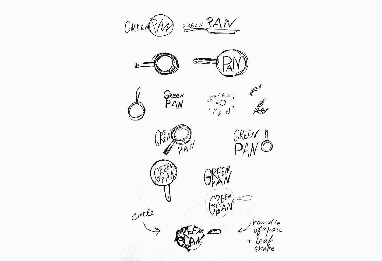


Logo Redesign Suggestions for GreenPan
By adopting a minimalist, modern design, GreenPan can better align its visual identity with its innovative product offerings. A redesigned logo featuring a refined cookware symbol, modern typography, and an updated color palette will reflect the brand’s premium and eco-friendly positioning.

Tools Used
Adobe Illustrator for logo design iterations
Adobe Photoshop for structuring and mockups
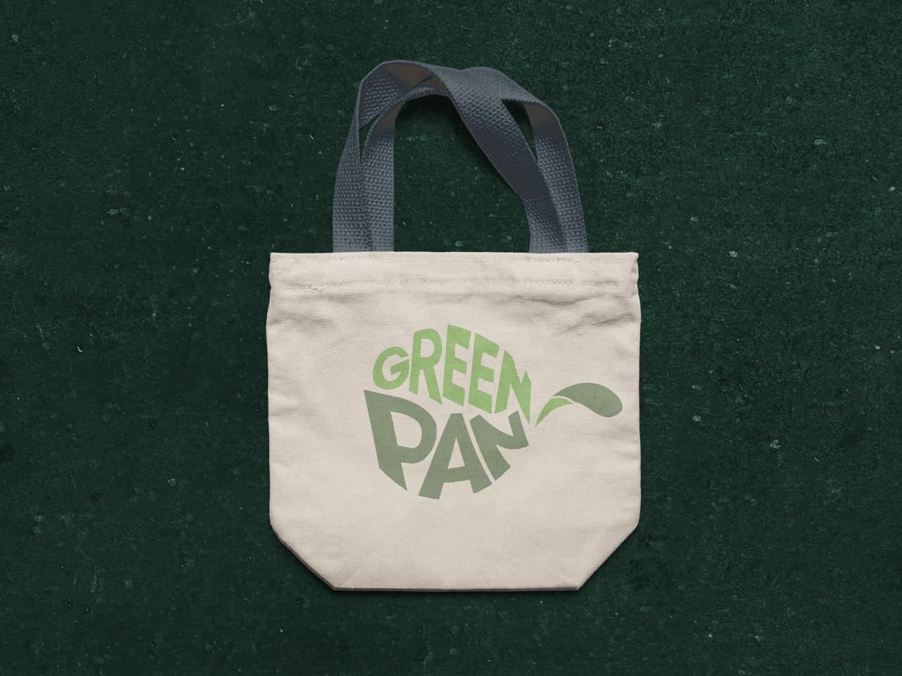
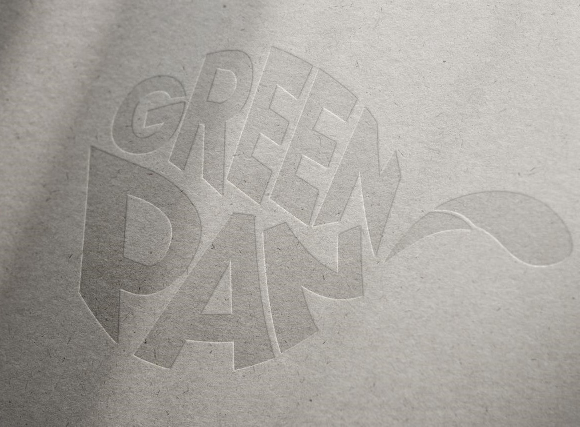
Final Design Outcome
The final ideation for GreenPan’s rebranded logo is a combination of modern, minimalist design with clear representation of the product category. It highlights the brand's eco-friendly ethos while ensuring the visual identity appeals to a premium market. By comparing the current GreenPan logo with competitors like HexClad, the final version offers a more competitive, versatile, and recognizable logo that reflects the brand's values and ambitions.