Choprabisco.be Case Study
Evaluating and redesigning the logo for Choprabisco.be, focusing on aligning it with the brand’s core values of sustainability, innovation, and talent.
Logo Evaluation and Improvement Areas

Logo Comparison: Choprabisco vs. Guylian
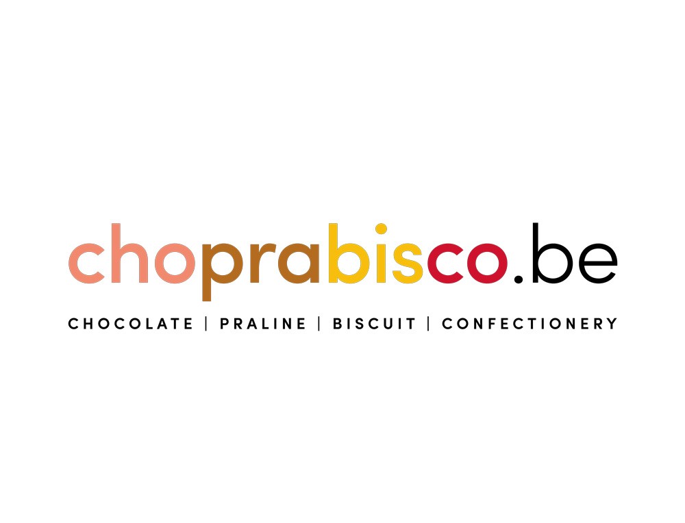
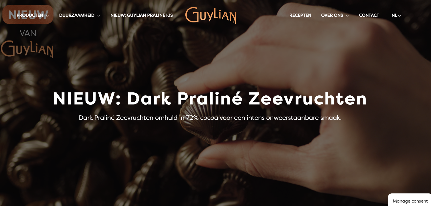
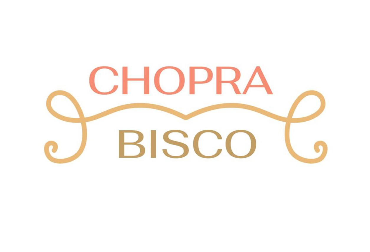
In comparison to Guylian’s premium logo, the current Choprabisco logo feels informal and lacks sophistication. Guylian’s clean, simple typography and soft gradients evoke elegance and trust. By adopting a more streamlined design like Guylian’s, Choprabisco can elevate its brand presence.

Key Issues Identified
Several areas in the current logo require improvement, especially to reflect the company's
ambitions:
Lack of Clear Identity: The logo does not reflect sustainability
or innovation, essential values for Choprabisco.
Color Palette Issues: While warm tones hint at chocolate and
pralines, they don't communicate eco-friendliness or innovation.
Typography Limitations: The playful font feels outdated and
doesn't align with the modern, innovative image Choprabisco wants to project.
Visual Hierarchy & Readability: The logo lacks a clear focal
point, and the color gradient can make it harder to read at different sizes.
Symbolism and Representation: No visual symbol or icon directly
ties to the core industries or values, limiting the logo's memorability.
Domain Extension Highlight (.be): The ".be" feels forced and
distracts from the main brand name.
Suggested Improvements
To align the logo with Choprabisco’s values of sustainability and innovation, the following changes
are recommended:
Introduce eco-friendly elements such as nature symbols or leaves
to reflect sustainability.
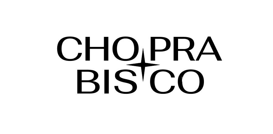
Adopt a more modern and clean typography to convey innovation.
Add a simple, memorable icon to represent core products like
chocolate or biscuits, giving the logo a unique identity.
Refine the visual hierarchy by emphasizing the brand name and
integrating the ".be" domain more subtly.

Challenges & Solutions
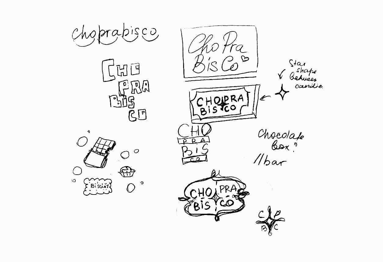
One major challenge in redesigning the logo was balancing fun elements with professionalism. The playful nature of the brand needed to be preserved, while incorporating a more refined, modern look to reflect innovation.
Tools Used
Adobe Illustrator for logo creation
Adobe Photoshop for creating mockups and visualizing the logo in
different contexts
Final Design Outcome
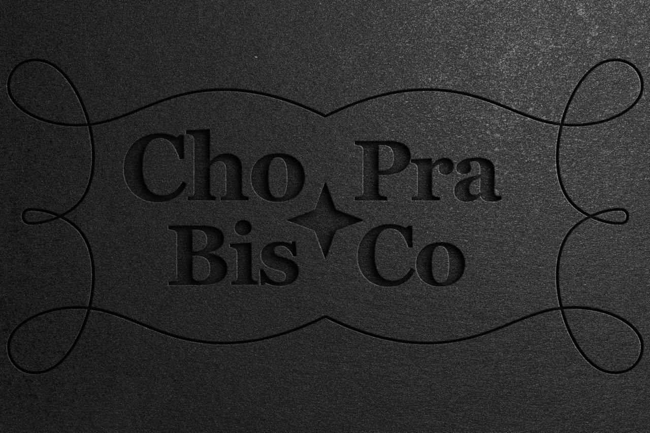
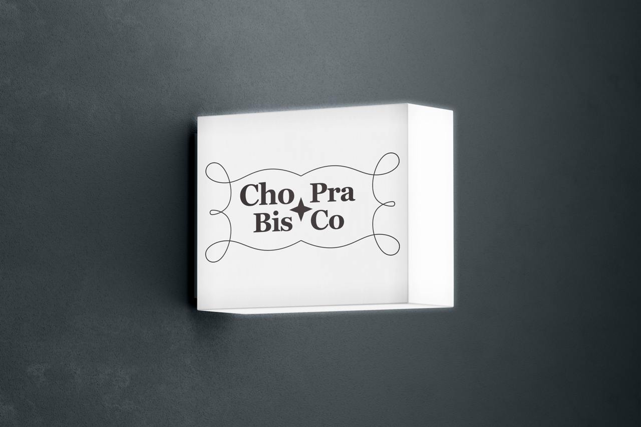
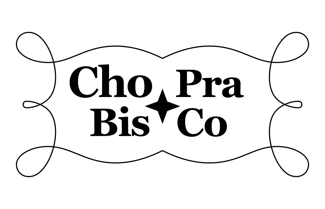
The redesigned logo aligns Choprabisco with its values of sustainability and innovation while maintaining its playful roots. A simplified modern font now better represent the brand’s ambitions in the confectionery market.

